Communication Objectives
As a group, our communication objectives were to make Cliffside Restaurant more approachable and keep our designs simple enough to where we were working with what the restaurant already had. The restaurant is very modern and simple in its own unique, beautiful way.
As I was working on the website, I wanted to make sure these objectives were shown through what I was created. That's why I wanted to take my own photos and focus more on the beauty of the food and the design of the restaurant. I think the colors of the food really brought out the beauty of the restaurant as well. My hope was to also create a user friendly and visually appealing website to make Cliffside more approachable for our audience.
Wednesday, December 7, 2016
Tuesday, December 6, 2016
My Artifact


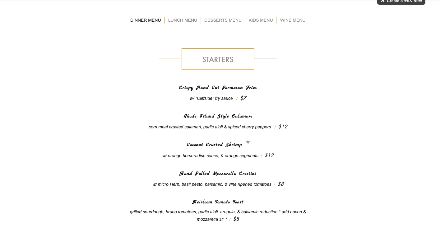

For my artifact, I decided to recreate Cliffside's restaurant. As a group, we wanted to keep the audience that Cliffside already has, but we also wanted to attract a younger audience as well. And I think this website can do that. It's a little for visually appealing and less plan than Cliffside's original website is. As for my inspiration for the website, I mainly wanted to keep it simple like the original website but also wanted to make it pop out more with bigger photos and our new logo. I took my own photos for this website, and even though they weren't the best, I tried to focus more on close-ups of the food and the dining areas to make it more appealing.
Sunday, November 20, 2016
Cliffside Restaurant
Our group decided that we're going to re-vamp Cliffside Restaurant here in St. George.
Audience analysis:
Tom, 54, is one of the owner's of Cliffside Restaurant and enjoys the fancy side of things. He's a perfectionist and aspires to keep his restaurant classy and somewhat high-end. He wants to attract more business to his restaurant by appealing to more than just the older generation.
Sarah, 21, is a stay-at-home mom and is always looking for new, delicious restaurants to go to with her husband for date night. She has a hard time finding baby sitters, but plans ahead for when she does find one. She also likes family-friendly places where she can take her kids and enjoy a family night out.
Leslie, 33, has been traveling to all 50 states with her husband and is looking for places to visit in southern Utah. She enjoys the outdoors and will go anywhere that stands out to her.
My artifact:
I will be doing a redesign of Cliffside Restaurant's menu on their website. It doesn't look that appealing right now and doesn't feature a lot of photos of the food. I will be redesigning it with our group's style guide and adding photos of the different dishes.
Wednesday, November 9, 2016
Mis-en-scene
Production designer for Interstellar: Nathan Crowley
Nathan Crowley started out as an art director and worked on movies such as Braveheart, Mission Impossible 2, and The Devil's Own. As a production designer, Crowley has worked on films such as Behind Enemy Lines, Insomnia, Veronica Guerin, Batman Begins, The Lake House, The Dark Knight and Public Enemies.
According to an article from IndieWire, "designing wormholes, black-holes and other space-time-bending phenomena was a first" for Crowley in Interstellar. This scene with Matthew McConaughey falling into the tesseract was done with a physical set instead of using CGI.
Crowley faced difficulties like designing these sets that had to do with jumping through space-time and designing far away planets. This set design with the tesseract scene seems to be more simplistic but also complex when watching the sequence. When looking at these two photos, I see the law of continuity play out with all of the lines in the set, which also goes along great with the theme of space throughout the film. I also see all of the other Gestalt principles as well, especially law of closure as all of these lines or blocks are close together and make up the tesseract itself.

Even though designing this set was a first for Crowley, I'm sure he got some inspiration from past set designs he has worked on. This one just seems more innovative.
Production designer for Interstellar: Nathan Crowley
Nathan Crowley started out as an art director and worked on movies such as Braveheart, Mission Impossible 2, and The Devil's Own. As a production designer, Crowley has worked on films such as Behind Enemy Lines, Insomnia, Veronica Guerin, Batman Begins, The Lake House, The Dark Knight and Public Enemies.
According to an article from IndieWire, "designing wormholes, black-holes and other space-time-bending phenomena was a first" for Crowley in Interstellar. This scene with Matthew McConaughey falling into the tesseract was done with a physical set instead of using CGI.
Crowley faced difficulties like designing these sets that had to do with jumping through space-time and designing far away planets. This set design with the tesseract scene seems to be more simplistic but also complex when watching the sequence. When looking at these two photos, I see the law of continuity play out with all of the lines in the set, which also goes along great with the theme of space throughout the film. I also see all of the other Gestalt principles as well, especially law of closure as all of these lines or blocks are close together and make up the tesseract itself.

Thursday, October 20, 2016
Compose your frame

I took this photo from my balcony. The rule of thirds apply here because the top of the spinning wind chime is the center of my focus. When it comes to vectors, the lines of the gate and the line of the old airport hill in the background both insert direction to the wind chime in the photo. There's also direction in the lines of the ceiling that the wind chime is attached to. If you look closely to the photo, there's a diagonal line in the road that's below the wind chime. This also adds a sense of direction and appeal to the photo.
Monday, September 19, 2016
Design Evaluation


I love seeing an impressive newspaper layout design. If I pick up a newspaper, and the layout is awful, I usually won't read the content. I chose this layout design from The Ithacan because it automatically caught my attention, and it's impactful. Not only is the story itself impacting, but the way the title works itself into the photo with "It happened" in the background, automatically drawing my eyes toward the woman. What I love the most about the title is the lower portion where it says "and it will again" is shaped and cut out from the grass, making the headline a part of the photo. With print design, it's so important to make your artwork as impactful as the story is. And that's exactly what this design does.
With this design, a Gestalt principle that stands out to me is figure/ground relationships. The distinct figure in this design is the woman on the ground, and the background and scene of the photo makes her stand out. I also see the law of continuity. Your eyes follow the path of least resistance. If you look closely, the path is easy to follow because the words are staggering from shorter to longer, and back and forth.
Other great examples of print design: https://designschool.canva.com/blog/editorial-design/

This design gives me a headache. There's a lot of white space going on this design, and that's a big no no with print design. I get what the designer was trying to do with the graphic, but it's disproportionate to the article, and the pills are a little too big to be visually appealing. There is no law on continuity here because it takes me forever to look through this page. And many of the other Gestalt principles don't apply to this design either.
Need a good laugh?: https://www.buzzfeed.com/lukelewis/newspaper-and-magazine-layout-disasters?utm_term=.lc1WW9W51#.uagPPXPxY
Monday, September 12, 2016
Markee, Beaux and Anthony

After walking around campus, this water sculpture in front of the Eccles building stood out to our group. Here are the Gestalt principles we found that apply:
Law of Pregnanz (Beaux): Reality is organized or reduced to the simplest form. On an individual basis, the sculpture is composed of a bunch of smaller shapes: squares, rectangles, elongated ovals, etc. On the other hand, the object is composed as a triangle/pyramid while comprising of many smaller shapes.
Law of Continuity (Markee): Lines are interpreted as following the path of least resistance. If you look at this sculpture closely, the lines flow with the way the water is flowing. The water flows off of the sculpture and down into a drain in a simple and easy manner.
Law of Similarity (Anthony): The definition for the law of similarity states that items that are similar are grouped together. The cement squares that make up the triangle are closely grouped into a triangle shape. Also, they are typically grouped together for a purpose, and that purpose might be for complex design. The similarities from the architecture of the design are similar to the architecture of the Eccles building itself.
Monday, September 5, 2016
Contrast, Balance, Harmony
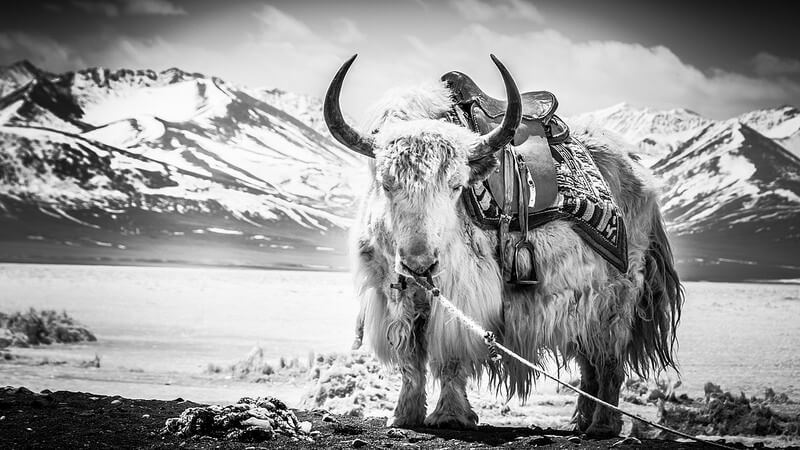
Here is a stunning photo of a Yak, which caught my interest because I've never seen one before. When it comes to contrast, the difference between the animal and the land it's on greatly shows contrast. The Yak itself has light fur, which is contrasted by the darkness of the mountains and even the Yak's horns, which are darker than the fur. Another way contrast is shown in this photo is by size. Yak's are typically large animals, but this one looks even larger because of the way the photographer framed the photo. The horns of the Yak are taller than the mountains in the background, making it seem larger.
With balance, this photo seems to have a symmetrical balance because the weight of the mountains looks equal compared to the Yak. And the Yak is symmetrically balanced itself because of it's facial features, The horns and face are symmetrical.
When it comes to Gestalt principles, figure/ground relationships would apply. The Yak is the main focus of the photo, but the landscape still draws people in and gives context to where this photo might have been taken.
I see harmony in this photo because of the contrast and the landscape. This light fur colored Yak would belong in a harsh environment like this, and the mountains in the background add to that feeling of harmony. It also shows harmony through repetition of the mountains and the way they point upward throughout the photo.
 |
| Portrait of a Yak by Sherrin Lim |
With balance, this photo seems to have a symmetrical balance because the weight of the mountains looks equal compared to the Yak. And the Yak is symmetrically balanced itself because of it's facial features, The horns and face are symmetrical.
When it comes to Gestalt principles, figure/ground relationships would apply. The Yak is the main focus of the photo, but the landscape still draws people in and gives context to where this photo might have been taken.
I see harmony in this photo because of the contrast and the landscape. This light fur colored Yak would belong in a harsh environment like this, and the mountains in the background add to that feeling of harmony. It also shows harmony through repetition of the mountains and the way they point upward throughout the photo.
Sunday, August 28, 2016
My Visceral Response


Photo by Ammon Cluff
When I think of something that has beauty in it, I automatically think of nature. Nature is beautiful to me in every way possible. Ammon Cluff, an amazing nature photographer residing in St. George, captured this beautiful image. The use of space and the way he's able to capture sunlight is indeed stupefying. Being able to look at mountains and being able to live surrounded by them makes me feel at home, and that's why I love this photo so much.
Color plays a huge role is this photo and is what grabbed my attention and admiration. There's so many beautiful colors in this image, including different values of purple throughout all the rocks. And on top of the pretty landscape is an intensity of yellow, specifically with the sun rays that point toward the ground. The sun rays also have to do with line, grabbing my attention and moving my eyes toward the landscape.
Spacing is greatly portrayed throughout this photo as well. The sky, mountains and landscape at the front of the photo all line together in a wide shot. Most of the space is taken up by the rocks in front of the photo.
Texture is also evident when it comes to the landscape. The purple/blueish rocks in front have a rough looking texture, while the sky in the background is smooth, creating a nice balance between the two.
Even though anyone can Google a nature image of Utah, something like this photo is meaningful to me because I live in Utah's very own backyard. It doesn't get much better than that.
Subscribe to:
Posts (Atom)